Netflix, a company known for innovation, creativity, and user experience.
Their recommendation system has been developed in a co-creational way using crowdsourcing in order to match best user experience. This competitional approach even made it into a
Harward Business Review. This, as an example of user centricity and focus on the client.
And now, with the newest release of the Netflix App on the Apple TV I am back in stone age when it comes to swiping through these recommendations. - Why? What happened?
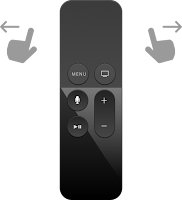
The entire user interface is built to scroll left and right for selection within one of my automatically identified favourite categories. And to scroll up and down for selection of respective categories.
And now, this "home", "search", ... menu bar has been moved to the very left and pops up every time I want to swipe left in order to go back while scrolling.
Going back, since the invention of computer terminals and the back space key, probably the most widely used function. The functionality of reflection, of reassessment, and of reconsideration.
I am wondering, what would happen to usage statistics, if you would take this "going back" feature away from the user experience.
So, Netflix in a way did, and probably knows these figures.
What I do not understand is, what designers expect me now to do? - Why has this been implemented?
Do they expect me not to reconsider any more?
Meaning, always move forward, don't look back, think only about what is coming and do not reflect what you have experienced a fraction of a second ago.
Do they want me to not remember the order of my favourites in "My List"?
Why doing it this way then? Would this not be easier with just randomly sort and resort those lists in the same way grocery stores work against our consumer habits by changing the place of items in the shelfs from time to time?
Do they want me to quit from Netflix on Apple TV?
If I get annoyed by non intuitive behaviour of the user interface, I will spend less time on the app, I will get stressed, and - since Netflix is rather part of recreational phases of my life - I will not turn back.
This can not be the goal!
So, what were they thinking?
Do they want to teach me to think prior to scrolling?
Slow down, decelerate, relax, ... If so, it does not work!
Now, how was the situation before deployment of respective change a couple of weeks ago.
Same, issue hit the end user actually while scrolling up and down in a way. Just, that the "home", "search", "settings", ... menu bar was seamlessly part of the rest of the experience. Integrated into the categories of favourites. And given the usage of respective functions, I am not sure why this was not a good solution.
I can understand that technically this was not the most logic way of doing it. But it worked.
Or was I just part of one subgroup of users who perceived this implementation as intuitive, while a majority of end users did not.
Is this the struggle with usability? - On one hand everything gest more granular and more personalised. On the other hand, when it comes to simplicity and reaching populations of users with simple implementations one needs to make tradeoffs in disfavour of certain populations.
Is this what is happening here? Is this what I am experiencing as a Netflix user on Apple TV? - Am I traded off against a statistical majority of other users?
Never mind. The current solution feels so odd that I can not imagine above scenario to be true. - But, who knows?


