Showing posts with label usability. Show all posts

Saturday, December 28, 2024

Performance Of Cleaner Robots In The Age of Autonomous AI

Dear AI and robotics developers, AI evangelists and promoters of artificial general intelligence, AGI. - Do you think we are spending current research money in the right place? 

It's all nice to have generative AI bots writing poems, emails, running sales conversations, making people buying stuff they would not even consider, .. and many more. However, how about solving some real world problems.

Who can come up with a vacuum cleaner robot that cleans to the expectations and requirements of my wife? - And that should not be that difficult!

While autonomous vacuum cleaner robots have made floor cleaning more convenient and hands-off, they still face usability and performance limitations. Their success largely depends on consistent maintenance, a suitable home layout (fewer thresholds, well-lit areas, minimal clutter), and user involvement in initial setup and ongoing upkeep. Advances in navigation, sensors, and battery technology continue to address many of these limitations, but buyers should still weigh their specific home environments and cleaning needs before choosing a robot vacuum.

And where are the corner and skirting board specialists? We are still missing these? And I think they won't depend on AGI. It's rather a question of if we are addressing the right problem, we are following the right requirements, and if anybody is paying for it.

Performance Issues:

  • Navigation & Coverage: Struggles with tight corners, thresholds, and under-furniture spaces; may miss areas or get stuck.
  • Battery Life & Runtime: Short battery life leads to incomplete cleaning; long recharge times can prolong cleaning cycles.
  • Cleaning Power: Limited suction on thick carpets or with heavy debris; small dustbins fill quickly.
  • Sensor Limitations: False cliff detection on dark floors; camera-based models can lose track in low light.
  • Maintenance & Reliability: Frequent brush cleaning for pet hair; filters clog easily; software or connectivity bugs can disrupt cleaning.

Usability Issues

  • Setup Complexity: Configuring no-go zones or complex app settings can be time-consuming.
  • Noise Levels: High suction modes can be disruptive, especially in small living spaces.
  • Ongoing Costs: Consumables like brushes, batteries, and filters add to long-term expenses.
  • User Involvement: Regular emptying of dustbins, clearing clutter, and software updates are still necessary.

To solve the corner problem; I am sure you would have ideas? - Btw, why are all these vacuum robots round? - To best mismatch with corners which are usually there in houses?
Do we have a technology platform issue? Are all vacuum cleaning robots based on the same architecture and foundational hardware technology expecting software to solve for the usability and performance issues?

Searching for most advanced autonomous vacuum cleaner robots on the market it seems that we are not the first ones to address this issues. There are some products on the market with special corner cleaning and skirting board features. To name just five examples - such as: 

  • Key Corner Feature: PerfectEdge™ Technology utilizes a squared-off front and specialized corner brush to clean edges and corners more thoroughly.
  • Other Highlights: Self-emptying base, intelligent mapping, and powerful suction for both carpets and hard floors.

Neato Botvac D10 (or D8/D9 Series)
  • Key Corner Feature: D-Shaped Design that allows the vacuum to reach deeper into edges and corners compared to round robots.
  • Other Highlights: LaserSmart LiDAR navigation for accurate mapping and custom zone cleaning, strong suction, and large dustbin capacity.
  • Key Corner Feature: Intelligent AI Object Recognition can help it navigate near walls and corners effectively without collision.
  • Other Highlights: Advanced camera and LiDAR sensors for obstacle avoidance, self-emptying clean station, and smart app control.
Ecovacs Deebot T10 (or T10 Plus / T10 Omni)
  • Key Corner Feature: Two side brushes that extend to pull in debris from edges and corners. Some models use additional sensors to maximize coverage near walls.
  • Other Highlights: Multi-floor mapping, optional self-empty station, and integrated mopping features in some variants.
  • Key Corner Feature: Dual side brushes and a design that allows the robot to run tightly along skirting boards for improved edge cleaning.
  • Other Highlights: Strong suction, reactive AI obstacle avoidance, and an auto-empty dock with mop-washing capabilities in the Ultra variant.
Might need some testing here! - Now, for major manufacturers the key requirements seem to have been addressed. 
Remains the question: Ar they fulfilling expectations and requirements to my wifes' satisfaction? - Would love to verify.

Tuesday, August 6, 2024

The Evolution of Blind Typing: From Nokia to Modern Smartphones

Typing text messages without looking at the screen has evolved significantly since the early 2000s. This journey from Nokia's physical keypads to today's touchscreens highlights advancements in mobile usability and ergonomics.


Early 2000s: Nokia and T9 Texting

Nokia phones in the early 2000s featured physical keypads that allowed users to type without looking. The T9 predictive text system was a game-changer, predicting words based on key presses and enabling users to type quickly using muscle memory. This tactile feedback made it easy to text blindly, with experienced users often typing messages from their pockets.

Mid-2000s to Early 2010s: QWERTY Keyboards and Early Touchscreens

The transition to QWERTY keyboards, like those on BlackBerry phones, offered more efficient typing but less tactile feedback, making blind typing harder. Early resistive touchscreens required precision and were not ideal for typing without looking. However, improvements in predictive text and autocorrect helped users type faster with fewer errors.

Modern Smartphones: Touchscreens and Voice Input

Today's smartphones feature capacitive touchscreens, which are highly responsive but lack tactile feedback, making blind typing nearly impossible. Haptic feedback provides some assistance, but not to the extent of physical keypads. Voice input technologies like Siri and Google Assistant have emerged, allowing users to dictate messages hands-free, marking a significant leap in usability.

Swipe typing is another modern innovation, enabling faster typing but still requiring visual confirmation.

Conclusion

The evolution from physical keypads to modern touchscreens and voice input illustrates that the future of mobile usability might not be about better keyboards but about improved user interaction. However, the effectiveness of voice input can vary based on the user's native language, raising questions about its universal applicability.

This shift emphasizes the importance of creating inclusive and accessible user interfaces that cater to diverse needs and preferences in the ever-evolving landscape of mobile technology.

Saturday, August 3, 2024

Transform Your Understanding of Design with The Design of Everyday Things

 Discover the Hidden Mechanics Behind Everyday Objects

Have you ever struggled with a door that wouldn't open the way you expected? Or found yourself baffled by a complicated remote control? These everyday frustrations are the very problems that The Design of Everyday Things by Don Norman addresses. In this revised and expanded edition, Norman, a pioneer in usability and cognitive engineering, unveils the principles of good design and explains how thoughtful design can make everyday life more intuitive and enjoyable.

Why This Book is a Must-Read

  1. Understand the Importance of User-Centered Design: Norman introduces the concept of user-centered design, where the needs and abilities of users are prioritized. This approach helps you understand how products can be designed to be both functional and delightful.

  2. Learn from Real-World Examples: Through engaging anecdotes and practical examples, Norman demonstrates the impact of design on our daily interactions with objects. These insights will change the way you look at everything from kitchen appliances to mobile apps.

  3. Empower Your Problem-Solving Skills: By exploring the psychology behind how we use objects, Norman equips you with the tools to identify and solve design problems. Whether you're a designer, engineer, or simply someone interested in the way things work, this book will enhance your problem-solving skills and creativity.

What Readers Are Saying

"This book is a revelation! It opened my eyes to the intricacies of design and how it affects every aspect of our lives. Highly recommended for anyone interested in understanding the world around them." Amazon Reviewer

"Don Norman's insights are invaluable. This revised edition is a treasure trove of knowledge for both beginners and seasoned professionals in the design field." - Amazon Reviewer

Take the Next Step in Your Design Journey

Don't let poorly designed objects frustrate you any longer. Dive into The Design of Everyday Things and start seeing the world through the lens of a designer. Whether you're looking to improve your professional skills or simply gain a deeper appreciation for the objects around you, this book is your guide to understanding the principles of effective design.

Get Your Copy Now on Amazon

Saturday, November 11, 2023

Why Products With Disastrous Usability Survive For Ages?

 To be successful in business you need to have a damn good product or service.

Recently while shopping - it was a week prior to Halloween and we were raising candy begging kids preparedness - I bumped into a huge bag of Carambar.

Memories from my childhood came up. Usually we got these at the local swimming pool in summer, or in winter when ice skating.

I immediately remembered how this mixture of caramel was sticking between the teeth. Always a bit afraid that it would never get off. It was so damn sticky but exceptionally delicious.

We bought the bag - it was a blend of different flavours. I could not remember that Carambar would come in flavours different than caramel. Maybe I just can not remember any more, or they've been adding in efforts of innovation initiatives some other flavours to the portfolio.

Halloween came, and unfortunately no kids were ringing the bell at the door. This led me to test this awesome product on my own.

I opened the bag and started to pick some of the bars and started to open them. - Immediately I had another very strong memory. The fact that you could never remove the packaging in one piece. Even worse, the fact that there were always - no matter how sophisticated your strategy of unpacking was - little pieces of the packaging material left sticking to the very sticky Carambar. 

Yes - in terms of unpacking usability, one of the worst products ever seen. And this for decades!

Now, since innovation is new flavours instead of making the original even better, I tested all versions in the bag.
They are all delicious. The innovation initiative obviously has been optimised for the right endpoints.

But packaging, ... total disaster!

I hope they did the testing of the packaging paper in terms of toxicity well, since I do not see kids being patient enough and having the right surgical skills to unpack a Carambar correctly getting access to clean and pure Carambar. 

Doing a bit of research. Carambar was invented in 1954. As it seems the product has been around eversince. The brand changed ownership which is nothing but uncommon for candy products.

One thing which is specially mentioned is a fact about the packaging. It's not the usability which sticks to consumers minds but another feature. - A special feature and French tradition is the packaging, which is printed on the inside with jokes or wisdom to amuse the consumer.

So, as it seems to consumers, the tricky unpacking is off set with some humour and jokes. - I just never got the paper staying in one piece for me to read the jokes.

Reading about importance of usability, there are numerous studies that proof that poor usability results in customers not buying from you.
Nevertheless, there are poor usability products surviving for decades.

What is usability? - It's when you don't get frustrated about the product you are interacting with?

Now in terms of Carambar? - The struggle in unpacking might increase the desire for the delicious sweet. And the sweet flavoured sticky Carambar is tasting so good that all the pain in getting to the point of tasting it is forgotten. - Is this the success of a product surviving already almost three quarters of a century?

What do you think? - With seven decades of success, would it be time to invest into packaging innovation? Or would this even destroy the authenticity and originality of the product?


Saturday, February 11, 2023

The Unprecedented User Experience of Continuous Blood Pressure Monitoring with Wearables

Heart disease is one of the leading causes of death worldwide, and high blood pressure is a major contributor to this problem. Until recently, monitoring blood pressure meant visiting a doctor, clinic or hospital and undergoing an invasive procedure with a bulky and uncomfortable cuff. Or measuring 24 hr profiles using a complicated system of cuff and pump taped to your body which made raise your bloods pressure just by the pure fact of irritating your body and comfort. 

However, advances in technology have changed the game, and continuous blood pressure monitoring is now possible with the use of an optical sensor wearable bracelet such as Aktiia - for example.

What is Aktiia?

Aktiia is a new generation wearable device - classified as a medical device - that continuously monitors blood pressure. It uses a unique technology based on photoplethysmography (PPG), which measures blood flow by shining light through the skin and detecting changes in blood volume. The device is worn on the wrist and can be worn 24/7, providing a continuous stream of data on the wearer's blood pressure.

This bracelet helped me to get my blood pressure - after episodes of unhealthy peak levels, and high night pressure - back under control.

The Unprecedented User Experience

The user experience of continuous blood pressure monitoring with Aktiia is truly unprecedented. With its sleek and comfortable design, the device can be worn at all times, providing constant monitoring of the wearer's blood pressure. This means that any changes in blood pressure can be detected and recorded immediately, allowing for early detection of any potential problems.

One of the biggest advantages of Aktiia is the ease of use. The device is simple to set up, and the accompanying app provides a user-friendly interface for tracking blood pressure and other health data. The app also provides personalized insights and tips for maintaining a healthy lifestyle, making it easier for users to stay on top of their health.

Another significant benefit of Aktiia is the ability to provide data in real-time. The device sends data wirelessly to the accompanying app, allowing users to see their blood pressure readings in real-time. This information can be used to make informed decisions about their health, such as adjusting medication or lifestyle changes.

Finally, Aktiia is also convenient for busy individuals. Unlike traditional blood pressure monitoring methods, there is no need to schedule appointments or visit a clinic. The device can be worn wherever the user goes, providing constant monitoring and data collection.

Conclusion

In conclusion, solutions such as Aktiia offer an unprecedented user experience for continuous blood pressure monitoring. With its sleek and comfortable design, ease of use, real-time data collection, and the ability to provide personalized insights, such wearable diagnostics devices are set to revolutionize the way people monitor and manage their blood pressure. Whether you're an individual concerned about your health or a healthcare professional looking for a more efficient way to monitor your patients, Aktiia provides a new and exciting solution.

Sunday, February 5, 2023

Usability of Hangers in Wardrobes

What are key success factors for hangers in wardrobes?

Factors that contribute to the usability of a hanger in a wardrobe include:

  1. Material: The material should be strong enough to support the weight of the clothing and durable enough to withstand repeated use.

  2. Size: The size should be appropriate for the type of clothing being hung and fit comfortably in the wardrobe.

  3. Shape: The shape should allow for easy access to the clothing and prevent the clothing from sliding off or becoming tangled.

  4. Hook design: The hook should be sturdy and allow for easy hanging and removal of the clothing.

  5. Space efficiency: The hanger should take up minimal space in the wardrobe to maximize storage capacity.

  6. Aesthetics: The hanger should be visually appealing and complement the aesthetic of the wardrobe.

  7. Price: The hanger should be affordably priced and provide good value for the cost.

In our wardrobe we have this one model of black hangers. - And I hate them for one reason!

Testing on above essential requirements:

1. Material: metal, black painted, ... all good - except that they make quite a bit of noise when hanging jackets or coats. The design makes them behave like a tuning fork in music.

2. Size: pretty much standard, ... all good - an given the lean design they are light enough.

3. Shape: basically there is no issue with the shape - except that one detail! - but let's cover that later.

4. Hook design: also here, basically no issue - it hangs very well to the wardrobe rail - except that one detail! - ...

5. Space efficiency: here, the model under discussion is exceptionally good. Absolutely no space is wasted on the rail.

6. Aesthetics: visually - I like it!

7. Price: for a designer piece, it was very affordable.

But now, that one usability issue which makes this product a total failure:

In the process of unhanging jackets I struggle each and every time with that little opening in the hanger, next to the hook. the way you would normally hang a hanger to the wardrobe rail, this opening is a true trap in the process!


Every time my jacket gets stuck and trapped in that little gap and if I do not rip a hole into the fabric of my jacket, I am at least well irritated and busy to get my jacket off.

Now, many people tell me - "don't stress out, just take both of you hands when taking a jacket off the hanger, or hang the hanger the other way around to the rail, ...".

NO! As a user I don't want to use both of my hands, because usually I have keys, a bag, or something else in my other hand. 

And, NO! I don't want to hang them the other way around. Why on earth should I?

In conclusion: another example of a household piece designed for aesthetics and not to serve its maximum purpose in the end user's process.

Saturday, January 30, 2021

Over-engineering - design for a smarter world

On many occasions I became irritated as the user of a product when noticing that the product was designed to be smarter than me. - Just have a look at many software products we are using in daily life, or at user interfaces from coffee machines, or at text completion on a smartphone, ...

Now, these days I bumped into this funny video about testing the sophisticated design of a children's play. I feel so sorry for the designer. It must be so painful for her (yes, it's an actor, but having been in the role of designers, testers, and end users, I have seen this situation many times).

It's funny to watch this scene, but imagine the scene while designing the play!

The designer get's all these fancy, and sophisticated requirements and use cases from some innovator, a product manager, or just from potential customers of the product. The tell him thousands of things what feature the product needs to exhibit.

In development, engineers think about these requirements about features and ask themselves, what problem the end user is going to solve with the solution. - Confusion arrises.

Often - I have seen this so many times - a dialog between designers and product managers evolves.

- Engineer: "what do you want to achieve with these elements of different form and shape"

- Product marketeer: "don't ask questions, just implement it - that's what you are paid for. Otherwise I can not sell that product."

- Engineer: "but it does not make sense - can we talk to some end customers"

- Product manager: "just do it! You are jeopardising my bonus payments!"

- ...

And so on, until the engineer does what he is asked for at the level of features. That's what he is paid for.

The result: yes, we know it!

- End user: "what the f... these stupid designers and engineers, have they ever been talking to a potential user?"

The moral of the story - you do know all of these books about user centric design, about lean business build up, about most uncertain assumption testing, ...!

Sunday, January 17, 2021

Heinz Ketchup - Usability of bottled tomato

Since 1869 Heinz is selling sauces in a bottle. - The legendary Heinz Ketchup has been introduced in 1876. The red tomato sauce in that characteristic glass bottle.

That bottle we all know very well and made our experiences with. A bottle which allows dosing of that delicious tomato sauce either in too low, or far too high volumes. - How about you? - I never get it right!

You still can buy Tomato Ketchup in that traditional glass bottle. - Why? - Who knows? - Usability, end user comfort, or great customer experience is not the reason. That's for sure!


In the meantime you can get it in flexible plastic bottles as well. Bottles which allow storage in the fridge, and more or less control over dosing.

Get a bottle here!

Hence Heinz - or Kraft Foods - is fully aware of the limitations of that fluidic sauce with variable viscosity. The effect is called thixotropy. And the combination of this red sauce called Ketchup and the famous Heinz glass bottle is leading to an extreme of such effect.

Interestingly this did not make the traditional non user friendly bottle to become extinct. 

Only Yesterday, I was invited for diner. We made hamburgers, and suddenly one of these traditional Heinz glass bottles showed up on the table. No skill on earth would help to control that red fluid to flow nicely out of that bottle. There is only the way of causing a big mess, or sticking your knife into the bottle in order to get some of the delicious sauce out. - No question, we survived. Everybody left the table well fed, and the mess on plates and table was not too big at the end.

But still, why did that bottle survive? - I just don't get it!

You could argue now that usability is subordinate and totally unimportant when it comes to usability. Is Heinz Tomato Ketchup in the traditional bottle another example - next to the German ERP software company SAP - that usability is totally unimportant in order to become global market leader? - Could well be!

Or is it just that the average Tomato Ketchup consumer is just not susceptible to usability questions and does not give respective feedback to the manufacturer?

Or, is a nostalgic bottle with horrible usability outweighing user experience? - Questions remain!


Tuesday, November 24, 2020

Coffee is vital to survival! - Usability of coffee machines could be key ...

I love coffee. - The taste, the smell, the process of brewing and preparing, ...


Now, if dinosaurs became extinct because of not having coffee, or just because of incredibly poor usability of coffee machines would be an interesting subject to study.

For me personally - usability of coffee machines is key!
As a long time user of the Nespresso coffee system - which I overall really like - I have to say that many things have been done right by Nespresso.

It is not that easy to develop a robust end to end system with third party manufacturers of coffee machines, brewing units, and probably a high heterogeneity and complexity in coffee production, roasting, and packaging processes in order to deliver a reliable and reproducible coffee at the finger tips of the end consumer..

However, there is that one trap I am falling into every single day at least once. - The empty water tank trap!

To put out a quote of a famous author of usability and user experience literature - "Don't Make me Think", Steve Krug

Products that require the user to think are just not finished!

It goes into same category as "any product that needs a manual to work is broken"- Elon Musk.

Now, how is this this with Nespresso coffee machines?

- Need for a manual: I can not remember that there is a need for that!
- Making me think: no, it does not make me think! - Nevertheless, I repeatedly fall into the same trap of missed usability! - The empty water tank!

Obviously, one key precondition for brewing a good tasty coffee is supply of water. With a non industrial coffee machine - a consumer model - where there is no direct and continuous supply of water filling up the water tank, and making sure that there is a critical level of water in the tank prior to starting the coffee brewing process becomes a user task.

Now, my problem!
It feels like every time I am approaching that Nespresso coffee machine in our kitchen, the water tank is empty. Given the fact that I do not like to think and the machine does not prevent me actively from pushing the button to start brewing a short or a long coffee, I am wasting quite a number of coffee capsules on water shortage events. - Why on earth has none of these coffee machines a clear and simple indicator on the front side of the product for low water supply levels? - Why?

Here some examples. The machines are well engineered - no doubt. The machines exhibit appealing designs - no doubt. The main operating functions - assuming filling water supply is not a main operating function which might be the major mistake of this set of product requirements - are easily reachable from the front. There was some usability engineering - no doubt. To place the water tank at the rear of the machine. That's not the worst thing to do. But, it's not the most convenient place when it comes to inspecting water supply levels. - A clear miss in assessing usability risks. Or, if it has been assessed correctly, then the mitigation is just a desaster!

I remember the early days of Nespresso machines. On the first generation machines the water tank was kind of a drawer at the bottom of the machine. And, there was a little indicator - mechanical, hence not expensive - which showed the current water levels from the front.

Now, there is that one argument of product designers - "the user will learn".
In my case - good, I might not be the average and most representative user - I do not learn about it. And my level of disappointment if the water supply pump runs dry is ever raising.

To conclude there are two questions remaining.
One, how big can such usability pain grow before a critical level for users to change product is reached?
And, two, what if dinosaurs became extinct due to poor coffee machine usability and not due to not having coffee available?


Sunday, August 2, 2020

The Soap Dispenser on Public Toilets

Every time I wash my hands in a public toilet I notice how badly positioned the soap dispenser and sink usually are. 

Yes, you should wash your hands with soap ... And, to do so, making use of the dispenser usually creates a big mess.

Soap dispensers regularly are placed to the left of the sink. If there are several sinks next to each other depending on where you are standing it might be to the right ;-)

The dispenser is mounted in a way that if some droplet of soap - given principles of gravity - drops, it drops on down to the floor.
Watch out for it! - You will rarely find a public toilet where underneath the soap dispenser there is not a big mess. Even the regular cleaning by cleaning staff over time can not cope with permanent stains.

The worst is with automatic dispensers. Dispensers having a sensor and dispensing only after the hand has been moved underneath. - Given the issue of latency time ... these designs are just too slow ... (see also my articles on general issues with latency in the automatized and digital world: Latency no. 1 and Latency no. 2) ... to securely drop the pre-specified amount of soap into the users hand. Usually one has already pulled back the hand before the soap dropping, resulting in systematic mess with soap on the floor.
As a result it then requires at least two attempts by the end user in order to get his soap into the hand which heavily impacts soap consumption.

A little bit better are dispensers which deliver soap as foam. The improvement here is just that the foam either sticks to the dispensers nozzle, or that the portion of foam does not drop that fast, so that a fast reacting user can still catch it before it is hitting the drop zone on the floor.

Now, the big question: why is this almost everywhere - exceptions apply - the case?
  • Is there a norm or standard that requires such design?
  • Is it just because nobody cares?
  • Is it because consumers and users just accept it and do not complain?
  • Is it because the cleaning staff just accepts it?
  • Why?
I doubt that I am the only one to notice. And I doubt that I am the only one who sees this a problem.
And given the enormous number of public toilets around the globe I doubt that there is no opportunity for a decent solution to that problem!

Saturday, May 16, 2020

A gardeners struggle - the soil bag

During spring and early summer, in the time of the year when plants start growing, everything is sprouting, nature in bloom, people start working in their gardens. According to statistics a habit two thirds of people in Switzerland share (reference).
The current COVID measures seem to drive this statistics even more in favor of sales of gardening supplies (reference).

Everybody is buying soil in various quantities. Many different flavors of soil. And, all packaged in laminated plastic bags. Bags, usually 80 - 100cm long, 40cm wide, and 8cm thick. Filled with premium soil at volumes of few liters for plants on terraces, up to 50 liters of garden soil for big projects. In any case, the package has a certain weight.

I never understood this packaging format! Why would you choose such packaging?
Obviously the responsible designers for these products have never been working in the garden. Or, they are extremely resilient to handling inconvenient products.

Every time I have to carry such a package I get upset.
If I grab the package with two hands on one of the short ends, it is difficult to carry the package and it risks constantly to slip out of my fingers.
If I grab the package with my hands along the longer dimension, then the package - given its weight - is bending through, slips out of my hands, and falls down on the ground.
If I grab it in the middle along the shorter dimension, it is bending through equally and it becomes difficult to carry.

When then loading the packages into the car, the next struggle starts. The dimensions of soil packages are not really fit for purpose. Obviously I need to pile the packages into the trunk of my car. And this is not an easy job. Virtually impossible if you are not Olympic weight lifter. Unloading is the same struggle in reverse order.

And then when ripping them open and trying to dose the amount of soil to be scattered into the plant bed. As soon as a certain amount of soil is missing in the package, the laminated bag becomes unstable. If not emptying the entire bag at once it becomes difficult to handle the package in controlled manner.
  
My practical experience with such packages is repeatably negative leading to higher levels of frustration.

How could one decide for this packaging format? What have been the requirements to come up with such package design?

One reason might be the possibility to pile many packages on a standard palette for transport and storage. 

Obviously an important argument and requirement. Efficient transport and storage is essential for a economically viable product. But, does it need to come at the price of modest customer experience and usability.


What I wonder is, if this packaging format has ever been put at a test with real day to day users.

Apart from the described scenarios above, many users can barely carry such packages given its dimensions and weight. I don’t want to know to how many serious back problems of people struggling to handle such packages the lack of customer centricity can lead.

Another interesting observation is the fact, that all manufacturers of packaged soil products use the exactly same packaging design. Why is that?

I can imagine several hypothetical reasons.
  1. Nobody cares about the user, given the fact that there is no alternative and people still are buying.
  2. Every producer is copy pasting from his competitor. Nobody is searching for differentiation. Nobody believes in consumers paying a premium for improved usability.
  3. Even tough there are many different vendors and brands there might be only very few producers of soil.
  4. There is only one serious manufacturer of respective packaging and filling systems. This would explain why there is almost no alternatively packaged products available.
  5. The packaging design experts are only doing me-too. With complete lack of usability exercises or user research.
  6. The cost requirements for packaging of garden and plant soil are so incredibly low that no other packaging is affordable.
There might be many more reasons ... And, are we as consumers willing to accept these?
What price would we be willing to pay for a better packaging design allowing acceptable handling of soil bags in the shopping, the transport, and use process?

How would a better package look like? What would be the features of a more ideal soil bag? Is there a format that could meet most of above requirements?

Some internet research gives already some hints. There might still be some products which are packaged in other format. Formats which might be more convenient to handle.

The package here to the right for sure has several advantages over the standard laminated bags. 

The handle on the top - foldable for being able to staple them on a palette (transport and storage requirements) - seems key to me. Only with a handle one can carry packages in a serious way. And depending on other dimensions and weight of the package it would even allow me to carry two packages at once, one with each hand. A much more balanced and more efficient way of carrying them.

If the package is less of a slim long bag, but more of a cuboid shape the usability of carrying them by the handle on the top becomes even better. A cuboid shape also fulfills the requirements for stapling the packages on a palette. They could be better organized into the trunk of a car, and could be better stored around the garden.

Also when using them in the garden; cutting the cuboid package open at one corner would allow to much more keep the shape of the package and dosing soil for use.

So, pretty simple and obvious to come up with a packaging format that might lead to much better customer acceptance. 
I am not a packaging expert. And I can well imagine that a packaging system for a cuboid product with a handle requires to manage some more degrees of freedom. But, given the quantities of soil being produced and sold in that business, and given the fact that such packaging and filling can be highly automated I would assume there is a case for such scenario. I could well imagine that going for such packaging could be a differentiating factor.

If you had the choice? Which package would you buy? And, would you pay a price for more convenience?

Wednesday, August 7, 2019

My new iPad Pro

I recently got an Apple iPad Pro. - Yes, the one with the fancy pencil, and the fancy keyboard.

Once again I was impressed by the overall user experience. Starting with the evaluation phase in the internet. Reading through the specifications and reviews. The lean product photography is already appealing and raises the desire to hold respective product in my hands.

Why do I want to buy an iPad Pro? - My old iPad Version 4 is seven or eight years old. Performance is getting limited, and that bulky pen with the balloon rubber bubble tip was a great user experience increasing usability especially when reviewing articles back then but not necessary today any more.

Why am I reaching limits in performance of that old iPad 4? - Probably mainly because my user behavior changed somehow. I am more often switching between apps, I am having several apps simultaneously open, and pushing the resources of that device. Everything else is working fine. It has been one of my best devices bought ever.

And then that fancy Apple Pencil on the new devices. - A gadget designed to the maximum of usability. But to experience this I need to go to the shop. No e-commerce will make me feel that experience over the internet. Haptic feeling and my biggest fear - will it work for left handed people - drives me to the next Apple shop.

But it‘s not only the hardware of this device which sounds appealing. It is also the imagination of what new possibilities such a setup could open up to me.
All my private and professional office in a small pocket, the possibility to do work wherever I am, bringing creative ideas - yes, the fancy pencil functionality again - to my digital devices as soon as possible...

I am walking into the shop. I tell the seller that I am interested in buying an iPad Pro. He asks me if I would be using it mainly for private or rather for business. My answer is - both!
Yes, private and business is blending more and more.

I am deciding quickly and walking out the shop with three well designed clean white packages. Spent some money on a new device which should bring some more joy to my life.

Am I a victim? - A victim of consumption? - Or, a victim of excellent usability and user experience design? - How did this all influence my buying decision?

Sunday, April 21, 2019

Develop for the better - The new Netflix App swiping left and right experience

Netflix, a company known for innovation, creativity, and user experience.

Their recommendation system has been developed in a co-creational way using crowdsourcing in order to match best user experience. This competitional approach even made it into a Harward Business Review. This, as an example of user centricity and focus on the client.

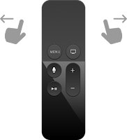
And now, with the newest release of the Netflix App on the Apple TV I am back in stone age when it comes to swiping through these recommendations. - Why? What happened?

The entire user interface is built to scroll left and right for selection within one of my automatically identified favourite categories. And to scroll up and down for selection of respective categories.

And now, this "home", "search", ... menu bar has been moved to the very left and pops up every time I want to swipe left in order to go back while scrolling.

Going back, since the invention of computer terminals and the back space key, probably the most widely used function. The functionality of reflection, of reassessment, and of reconsideration.

I am wondering, what would happen to usage statistics, if you would take this "going back" feature away from the user experience.
So, Netflix in a way did, and probably knows these figures.

What I do not understand is, what designers expect me now to do? - Why has this been implemented?

Do they expect me not to reconsider any more? 
Meaning, always move forward, don't look back, think only about what is coming and do not reflect what you have experienced a fraction of a second ago.

Do they want me to not remember the order of my favourites in "My List"?
Why doing it this way then? Would this not be easier with just randomly sort and resort those lists in the same way grocery stores work against our consumer habits by changing the place of items in the shelfs from time to time?

Do they want me to quit from Netflix on Apple TV? 
If I get annoyed by non intuitive behaviour of the user interface, I will spend less time on the app, I will get stressed, and - since Netflix is rather part of recreational phases of my life - I will not turn back.
This can not be the goal!

So, what were they thinking?


Do they want to teach me to think prior to scrolling?
Slow down, decelerate, relax, ... If so, it does not work!

Now, how was the situation before deployment of respective change a couple of weeks ago.
Same, issue hit the end user actually while scrolling up and down in a way. Just, that the "home", "search", "settings", ... menu bar was seamlessly part of the rest of the experience. Integrated into the categories of favourites. And given the usage of respective functions, I am not sure why this was not a good solution.

I can understand that technically this was not the most logic way of doing it. But it worked.
Or was I just part of one subgroup of users who perceived this implementation as intuitive, while a majority of end users did not.
Is this the struggle with usability? - On one hand everything gest more granular and more personalised. On the other hand, when it comes to simplicity and reaching populations of users with simple implementations one needs to make tradeoffs in disfavour of certain populations.
Is this what is happening here? Is this what I am experiencing as a Netflix user on Apple TV? - Am I traded off against a statistical majority of other users?

Never mind. The current solution feels so odd that I can not imagine above scenario to be true. - But, who knows?

Saturday, February 24, 2018

Latency - No. 1

Latency Definition. Latency is the amount of time a message takes to traverse a system. In a computer network, it is an expression of how much time it takes for a packet of data to get from one designated point to another. It is sometimes measured as the time required for a packet to be returned to its sender. (reference: link)

Everybody working with computer systems is facing latency problems.

The time the computer needs to start in the morning - Windows welcoming the user for several seconds.

The time the washing machine takes to be ready to start the program when switched on.

Do you know that feeling? - The TV system asking you "Please Wait...", then "System downloading software upgrade...", "System updating...", "System rebooting...", ... your impatience levels are raising, until you finally get a TV image just to notice that the weather report you wanted to watch is over and you are supposed to consume some publicity instead.

Who guarantees that the reading of your newest smart watch is not compromised by latencies in the management of its computing resources?

Latency, now even when starting up your car, the coffee machine, the vacuum cleaner, ...

One of my favourites is when pushing the power on button on the remote control of my TV screen. The time it takes until the TV shows a visible reaction is so long, that usually I happen to press the button a second time which makes the TV to switch off again. There is no way of seeing wether the first push is doing the job or not!

Another example are SW applications with long response times. Leading to the user clicking around and inducing more and more actions to the system leading to even worse response.
The worst is if typing on a keyboard and the characters showing up on the screen are substantially delayed.

How much latency are we willing to accept?

On one hand we believe that digitisation is improving productivity, reducing inefficiencies, making us more productive and effective. On the other hand we are facing more and more time of enforced delays at steps of our working processes where we have many needs as users, but absolutely no need of waiting.

“For example, Amazon calculated that a page load slowdown of just one second could cost it $1.6 billion in sales each year.” (reference: link)

Already in the very beginning of broader prevalence of computer systems impact of response times on human performance have been performed. There are many studies on the subject being performed in the 1970ies and 1980ies (see: link). These studies have been focusing on response of command entry on keyboards, and response of database requests.

Now, with more and more digital technologies entering our daily life. What are impacts of response and latency times in our life processes?

Is it truly offering added value if my washing machine has a digital control unit which takes 10 seconds to start up compared to the electromechanical version 10 years ago which was instantly ready? - The time prognosis on completion of the washing program is still inaccurate by +/-10 minutes both in the digital and in the electromechanical world.

Having a backward camera on the car which activates when switching to the rear gear is definitely a major improvement compared to the cumbersome navigation by turning your head in non-anatomical positions and looking through small mirrors on the side of the car. But it only helps if switching on the backward camera does not take longer than a couple of tenths of a second.

Or DAB radio. Yes, it is beneficial to have good quality or no signal at all. No tweaking of signals with difficult to manipulate buttons. But, what is the benefit of having to wait several seconds when switching radio channels. In the analog world this was instantaneous with mostly acceptable instantaneous sound quality.

There are many examples where we are limiting ourselves by accepting latency times in the context of technological advancement.
Why are we doing so?
Is it because we are most likely driven by technological fascination and not necessarily by user experience.
Also, the willingness to accept latencies as reality is often too high because end users are not in the position to change anything. And adaptability of users to the current situation of response is quite high.

Nevertheless - for me focus on efficient response and low latency times is one of the most important aspects when designing user experience.
We should always ask ourselves what it we would have to accept in alternative solutions. If these alternatives are old analog or mechanical solutions. We should challenge if accepting longer response times than the mechanical solution can truly be part of a beneficial solution.
If we want to sell the digital solution as a major benefit in efficiency gain for a previous process. Then the tolerance on waiting times should not be too big.

An easy rule of thumb could be something like:

If the system's response times are longer than the reading, inspecting, and thinking times of the user, then it is definitely adding pain to the user experience.
If the response times are longer than the time required by the user between two manipulations then this is definitely not adding value but becoming a stress factor.

Monday, August 1, 2011

Apple OS X Lion's scroll direction

It seems that the "natural" feature is not very popular:

http://www.tuaw.com/2011/07/21/poll-lions-natural-scrolling-vs-reverse-scrolling/

What does it mean if almost 50% of users consider the "natural" way not to be the most intuitive way?

"Natural" might be intuitive on a touch screen display. However, using navigation devices such as a mouse or a touchpad our brain still needs to project the action of the navigational device to a visual reaction on the screen. Hence, popularity of "natural" is a question of imagination not of intuition.

This leaves the question out: when will Apple come up with Mac Books and iMacs exhibiting screen touch features? - Probably soon.